creating a scalable app for the bulk frieght industry
Role
wireframes, visual design, design system, object mapping, user flows
Platform
ios, android
Client
BulkLoads
background
BulkLoads is a load searching app for carriers working in the bulk freight industry. The app connects carriers with loads based on their location, eqipment type, and other factors specific to their availability.
Finding loads is competitive, and carriers want to have the best tools available in order to find them quickly. Carriers on BulkLoads are also hesitant to adopt too much change. The initial app had a lot of helpful features that went beyond load searches, but they had a low adoption rate. BulkLoads wanted to expand beyond a load search app. The goal was to simplify the current features, and create a scalable design system to make it easier for carriers to learn and adopt new features.
simple to use, easy to grow
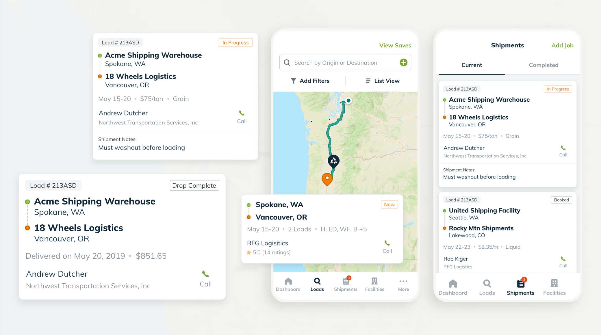
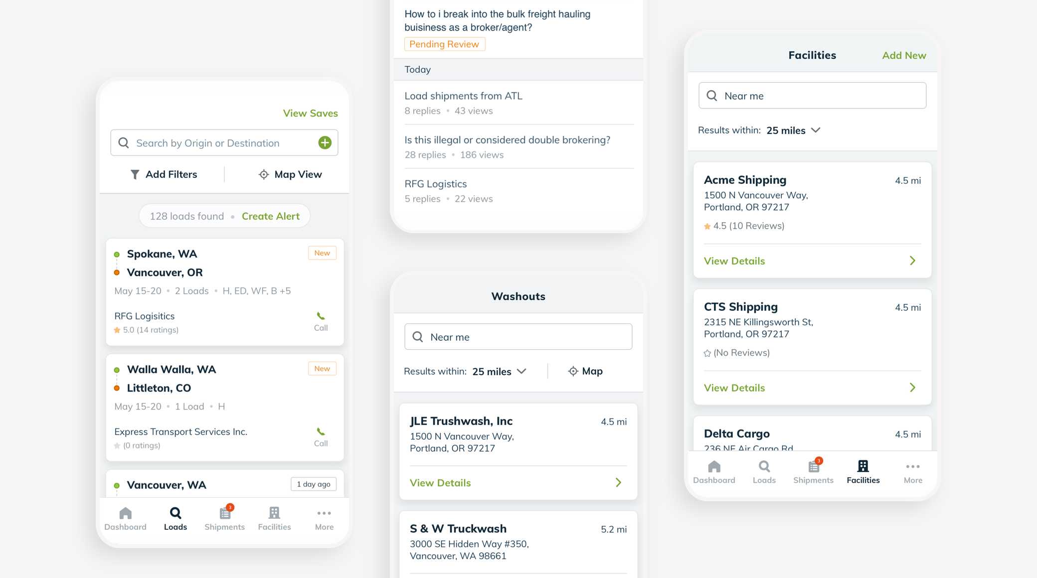
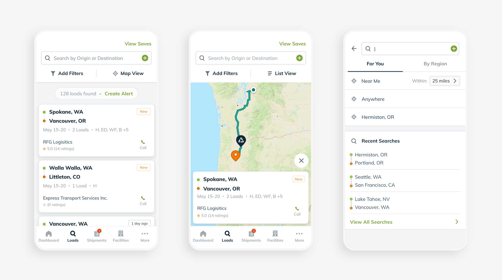
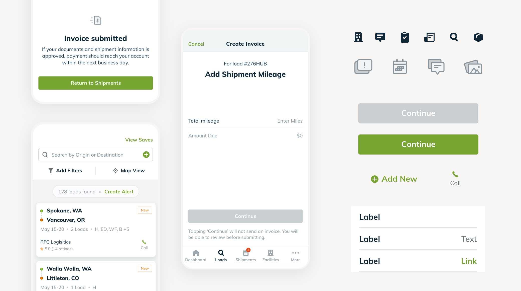
The initial step was to rework important flows to make features easier find and understand. I worked with the team on the load search, washout locator, and forum.
I explored ways to condense mutiple load search types into a more streamlined flow. The first assumption was that a carrier would want to find all loads in a specific location. Then, they would want to filter the results based on specific needs, such as truck type, product, etc.
This led to a single search where carriers could add a city or state and immeditely see those results. If a specific route was needed, a destination could be added.
familiar, but new
The flows were changing a lot. The design needed to feel familiar so that it still felt like the old app, but updated. I worked on style foundations and contributed to the design library by organizing styles and creating reusable components. Select colors and wording from the previous designs were used to make it feel more familiar for carriers that use the app every day.
Contributing to the shared library involved organizing styles, creating symbols, and providing documentation for development. I took leadership over consolidating similar components in order to create reusable patterns.
introducing new flows
The project included multiple versions to add features that would allow drivers to update information and for shippers to track a load’s status.
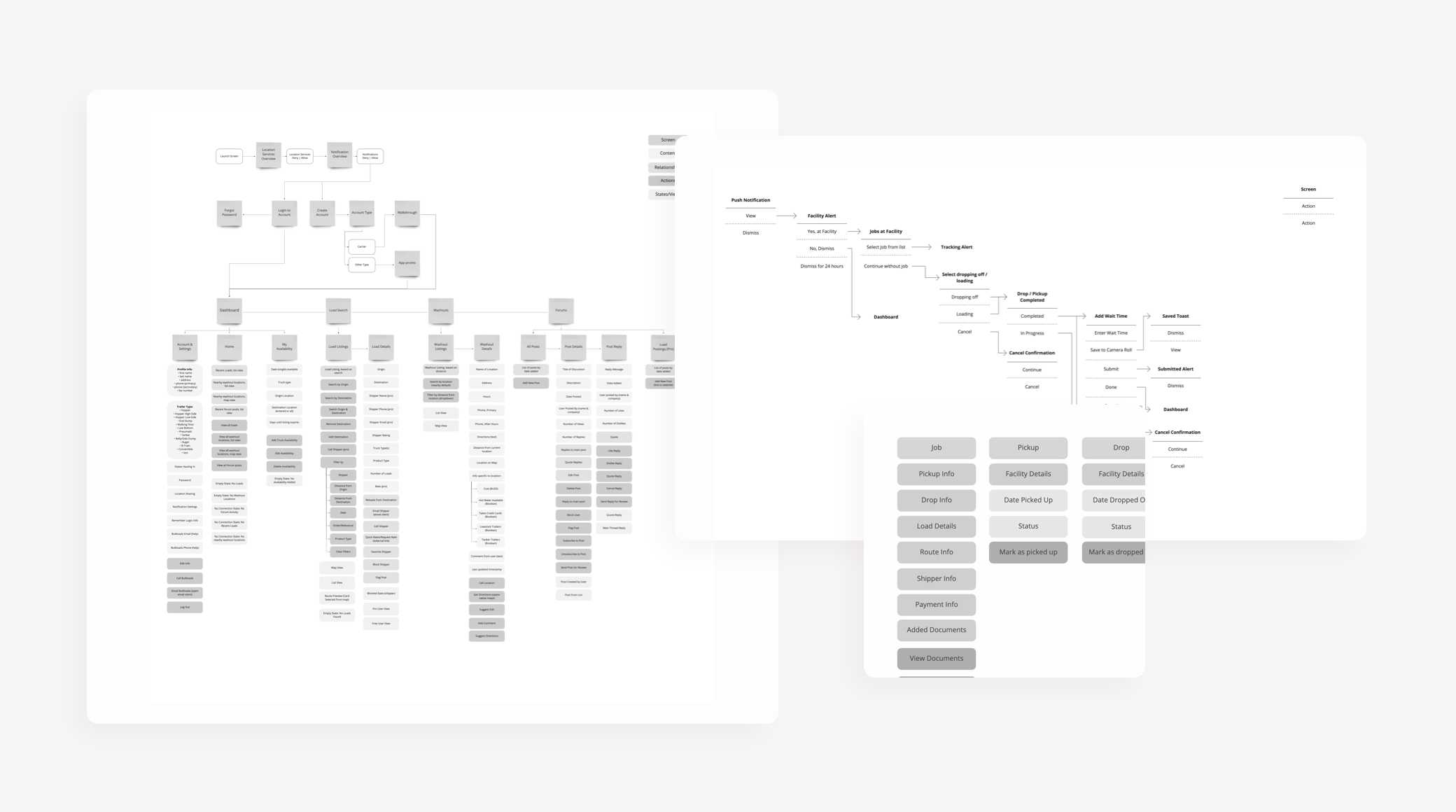
Since this involved adding flows completely new to the drivers, I focused first on mapping out how a driver would navigate through the various actions using a series of shorthand user flows. This helped highlight areas that could be more complex for carriers to complete. Before designing, I also defined the objects and actions needed to complete the flow to see areas where patterns could be reused.
final thoughts
While I worked on the project, we delivered 3 versions of the app. This included both updating existing flows to continue to simplify and adding new features.
The most challenging part of this project was adding to existing designs in a way that that made it feel integrated and easy to understand. To do this, the designs focused on reusable patterns, and placing actions within the context that a carrier would most likely use them. Empty states were utilized to guide carriers through flows, and not overwhelm with too many options. The result including step-by-step tasks that broke down a job from pick-up to payment, allowing a carrier to focus on getting their loads to the destinations.